warehouse_data <- data.frame(
  id = 1:19,
  fulfilled = c(803, 865, 795, 683, 566, 586, 510, 436, 418, 364, 379, 372, 374, 278, 286, 327, 225, 222, 200),
  accuracy = c(0.86, 0.80, 0.84, 0.82, 0.86, 0.80, 0.80, 0.93, 0.88, 0.87, 0.85, 0.85, 0.83, 0.94, 0.86, 0.78, 0.89, 0.88, 0.91),
  error = c(0.10, 0.14, 0.10, 0.14, 0.10, 0.16, 0.15, 0.06, 0.11, 0.07, 0.12, 0.13, 0.08, 0.04, 0.12, 0.12, 0.07, 0.10, 0.07),
  null = c(0.04, 0.06, 0.06, 0.04, 0.04, 0.04, 0.05, 0.01, 0.01, 0.06, 0.03, 0.02, 0.09, 0.02, 0.02, 0.10, 0.04, 0.02, 0.02)
)Recreating the STWD Look
This article demonstrates how to recreate the “Storytelling with Data” (SWD) style visualization from Albert Rapp’s excellent tutorial using the stwd package.
The original visualization shows warehouse order accuracy data with strategic color highlighting to draw attention to problem areas.
The Data
We’ll use warehouse fulfillment data with accuracy, error, and null rates:
Step 1: Prepare the Data
Reshape to long format and add summary row:
# Calculate averages
averages <- data.frame(
  id = "ALL",
  accuracy = mean(warehouse_data$accuracy),
  error = mean(warehouse_data$error),
  null = mean(warehouse_data$null)
)

# Combine and reshape
dat_combined <- warehouse_data |>
  mutate(id = as.character(id)) |>
  select(id, accuracy, error, null) |>
  bind_rows(averages) |>
  pivot_longer(
    cols = c(accuracy, null, error),
    names_to = "metric",
    values_to = "value"
  )

# Order by error rate and set factor levels
error_order <- warehouse_data |>
  arrange(error) |>
  pull(id) |>
  as.character()

dat_combined$id <- factor(dat_combined$id, levels = c(error_order, "ALL"))
dat_combined$metric <- factor(dat_combined$metric, levels = c("accuracy", "null", "error"))

# Add highlight color for high-error warehouses
high_error_ids <- warehouse_data |>
  filter(error > 0.10) |>
  pull(id) |>
  as.character()

dat_combined <- dat_combined |>
  mutate(
    highlight = ifelse(id %in% high_error_ids & metric == "error", "highlight", "normal")
  )
Step 2: Build the Base Chart
Create the horizontal stacked bar chart with strategic coloring:
base_chart <- ggplot(dat_combined, aes(x = value, y = id, fill = interaction(metric, highlight))) +
  geom_col(position = "stack", width = 0.7) +
  scale_fill_manual(
    values = c(
      "accuracy.normal" = "#CCCCCC",
      "accuracy.highlight" = "#CCCCCC",
      "null.normal" = "#E5E5E5",
      "null.highlight" = "#E5E5E5",
      "error.normal" = "#999999",
      "error.highlight" = "#E69F00"
    ),
    guide = "none"
  ) +
  scale_x_continuous(
    labels = scales::percent,
    position = "top",
    expand = c(0, 0)
  ) +
  labs(x = NULL, y = NULL) +
  theme_stwd() +
  theme(
    panel.grid.major.y = element_blank(),
    axis.ticks = element_blank()
  )

base_chart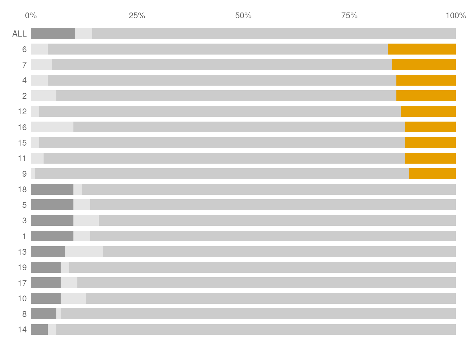
Step 3: Add the Story with stwd
Now we compose the full story layout using stwd block functions.
Whilie you can do this manually, where the package benefits truly shines is using the designer() function
stwd::story_designer(base_chart)This will create a shiny application that allows to easily add in the various elements that you want to finalize your graph.
When done, simplify copy and paste the code below

# Define colors for the legend
legend_colors <- c(
"ACCURATE" = "#CCCCCC",
"NULL" = "#E5E5E5",
"ERROR" = "#E69F00"
)
# Compose the story
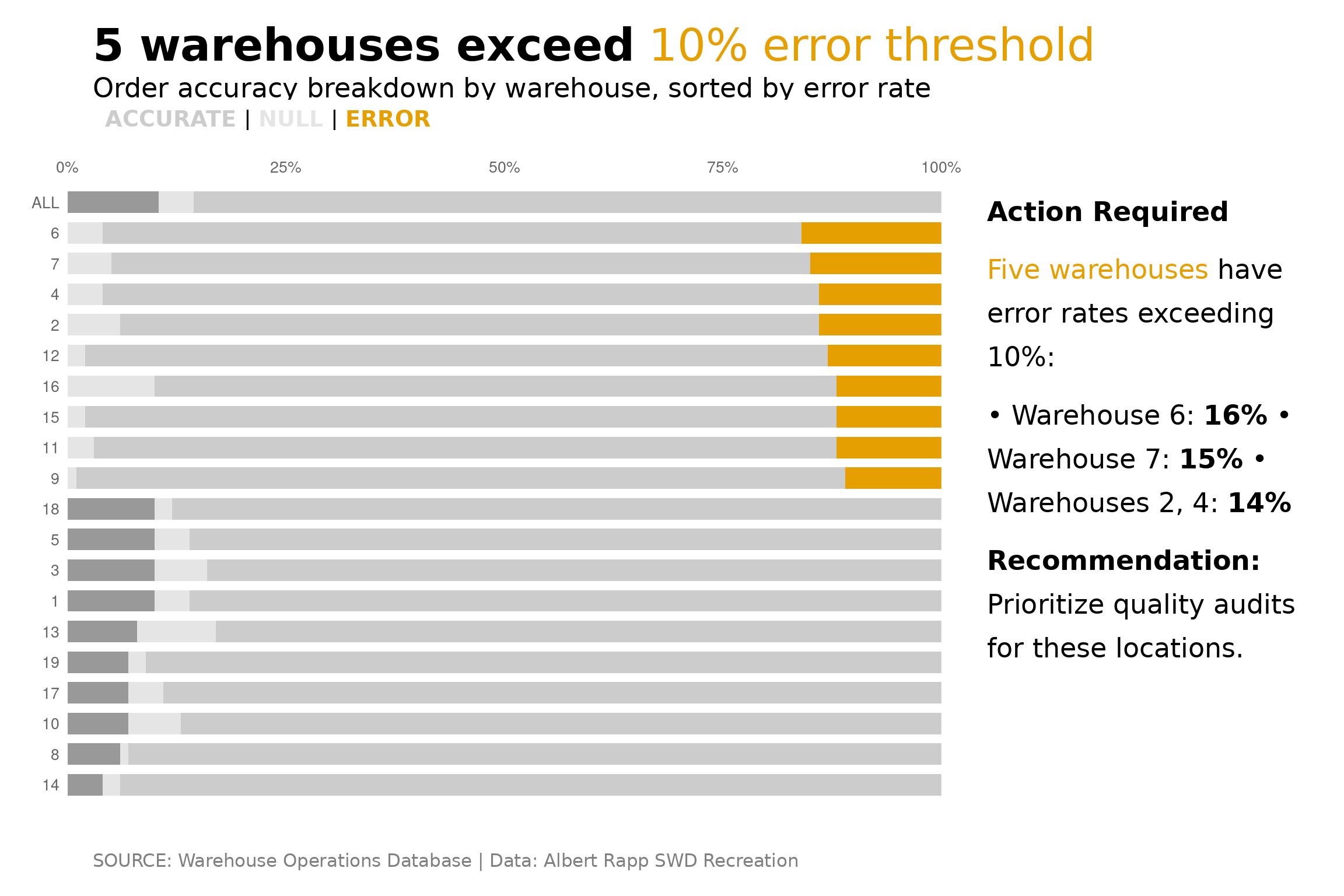
title_block(
"**5 warehouses exceed** {#E69F00 10% error threshold}",
title_size = 10
) /
subtitle_block(
"Order accuracy breakdown by warehouse, sorted by error rate",
subtitle_size = 6
) /
legend_block(
legend_colors,
halign = "right",
sep = "
| ",
size = 5
) /
base_chart /
caption_block(
"SOURCE: Warehouse Operations Database | Data: Albert Rapp STWD Recreation",
caption_size = 4
) +
plot_layout(heights = c(0.06, 0.04, 0.03, 0.82, 0.05))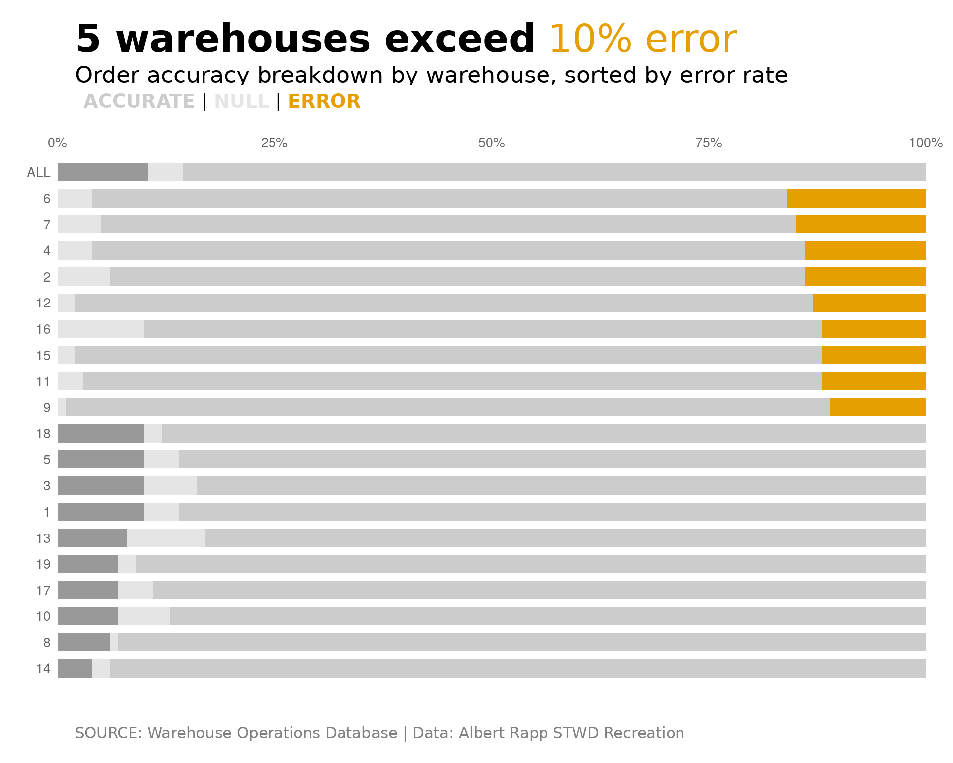
Step 4: Add a Narrative Panel
For a more complete story, add an explanatory narrative:
narrative <- text_narrative(
  text = "**Action Required**

{#E69F00 Five warehouses} have error
rates exceeding 10%:

• Warehouse 6: **16%**
• Warehouse 7: **15%**
• Warehouses 2, 4: **14%**

**Recommendation:**
Prioritize quality audits
for these locations.",
  size = 6,
  halign = "left",
  line_height = 1.3
)

# Chart with narrative side-by-side
content_row <- base_chart + narrative + plot_layout(widths = c(0.72, 0.28))

title_block(
  "**5 warehouses exceed** {#E69F00 10% error threshold}",
  title_size = 10
) /
subtitle_block(
  "Order accuracy breakdown by warehouse, sorted by error rate",
  subtitle_size = 6
) /
legend_block(
  legend_colors,
  halign = "right",
  sep = " | ",
  size = 5
) /
content_row /
caption_block(
  "SOURCE: Warehouse Operations Database | Data: Albert Rapp SWD Recreation",
  caption_size = 4
) +
  plot_layout(heights = c(0.06, 0.04, 0.03, 0.82, 0.05))